Colour is one of the most commercially sensitive aspects of packaging. It is also one of the most frequent sources of friction between brand owners, converters, and film suppliers. Pantone matching on flexo-printed CPP and metallised films is achievable – but it requires a clear understanding of what affects colour, how to specify it correctly, and what the realistic tolerances look like in production.
This guide is written for brand managers, packaging buyers, and marketing teams who want to understand the Pantone matching conversation before walking into a press approval or supplier review.
Why Colour Matching on Flexible Films Is Harder Than on Paper
When a designer creates a brand identity using a Pantone reference, the specification is made against a standardised printed swatch on coated paper under controlled lighting. Flexible film substrates – CPP, metallised film, BOPP – behave very differently from paper:
- Film surfaces are non-absorbent – ink sits on the surface rather than being partially absorbed, changing how colour is perceived
- CPP has a natural optical blue-white tint that shifts warm colours
- Metallised substrates introduce a mirror-reflective base that fundamentally changes how inks appear over and adjacent to the metal layer
- Film is flexible – the colour shifts slightly as the substrate flexes under different angles of light
- Flexo printing typically uses lower viscosity inks than offset or gravure, limiting achievable colour density in a single pass
None of these factors make Pantone matching impossible. They do mean that specification, proofing, and approval need to be structured around what the substrate and process can actually deliver.
How Flexo Colour Is Built
Flexographic printing uses anilox rollers to meter ink onto photopolymer plates and then onto the substrate. Colour is built through:
- Spot colours – a single Pantone-matched ink mixed to a specific formulation, printed in one station
- Process colours (CMYK) – four-colour halftone build producing a wide gamut through dot combinations
- Extended gamut (CMYK + Orange + Green + Violet) – increasingly used in HD flexo for wider colour reproduction
For Pantone matching, spot colours are always the most accurate approach. CMYK builds of Pantone references typically drift by Delta E 3–8 units, which is visible to the trained eye and often unacceptable for primary brand colours.
Delta E – The Standard Language of Colour Deviation
Delta E (ΔE) is the metric used to quantify the difference between a target colour and the printed result. Industry conventions:
- ΔE < 1.0: Imperceptible difference – not achievable in standard production flexo
- ΔE 1.0–2.0: Acceptable for most brand applications with consistent process control
- ΔE 2.0–3.5: Visible to a trained eye; acceptable for secondary colours, debatable for primary brand colours
- ΔE > 3.5: Clearly visible difference – typically triggers a reprint discussion
On CPP and metallised substrates, consistent production ΔE of 1.5–2.5 for spot Pantone colours is a realistic target with a skilled converter using calibrated equipment. Expecting ΔE < 1.0 on production runs is unrealistic and will cause ongoing friction.
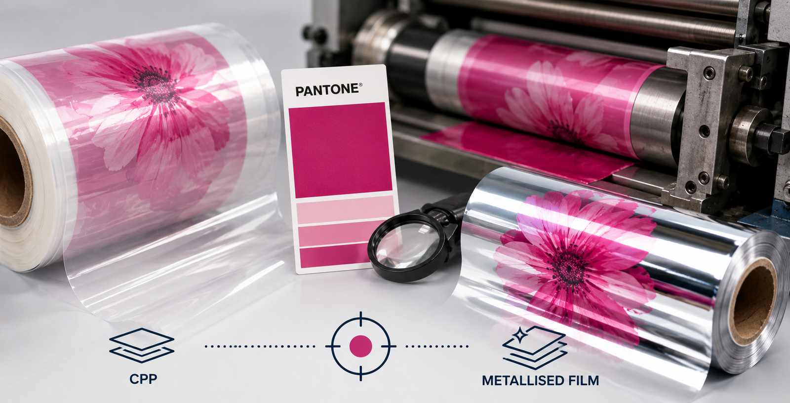
The Substrate Effect: CPP vs. Metallised Film
Printing on CPP
Clear CPP is a forgiving substrate for flexo printing. The transparent base allows the ink to read close to its inherent colour. Key variables are surface corona treatment level (38–42 dynes/cm optimal), ink-film compatibility (ensure the ink is rated for CPP/polypropylene surfaces), and print speed versus colour density.
White CPP is used as an opacity base for reverse-printed laminates. On white CPP, colours tend to read brighter and warmer than on clear. This must be accounted for in ink formulation.
Printing on Metallised Film
Metallised film introduces a highly reflective base that amplifies colour saturation but creates a metallic cast on lighter colours. Semi-transparent inks will pick up the reflective silver base, creating a metallic wash that no Pantone reference captures accurately.
Best practice for metallised substrate printing: use opaque white as a base flood coat before printing colours, which eliminates the mirror-reflective influence and gives a neutral base more comparable to paper. Without this, Pantone matching becomes extremely difficult and the results are inconsistent across different metallisation lots.
Setting Up for Successful Pantone Matching in Production
Step 1: Provide Pantone References, Not Just RGB/HEX
Digital files reference colours in screen-space RGB or HEX. These are device-dependent and have no direct mapping to printing inks. Always provide the specific Pantone Coated (C) reference number for each colour to your converter. Include the Pantone Fan Guide page reference if possible.
Step 2: Request an Ink Drawdown Before Plate Making
Before printing proofs, ask your converter’s ink supplier to provide a drawdown – a hand-applied ink sample on your actual substrate – for each critical colour. This costs nothing and reveals immediately whether the ink formulation is close to target before any printing expense is incurred.
Step 3: Conduct a Press Proof, Not Just a Digital Proof
Digital proofs (even calibrated ones) cannot replicate what flexo ink looks like on CPP or metallised film. A press proof on production equipment with production-run anilox volumes and actual inks is the only reliable pre-approval tool. Budget for press proofs on new designs.
Step 4: Set Approved Limits with a Physical Standard
After approval, retain a signed, sealed sample of the approved colour from the proof run. This becomes the production standard. All subsequent runs are measured against this physical standard under standardised lighting (D50 or D65 illuminant). Specify the acceptable ΔE range in your purchase order.
Step 5: Control the Variables That Shift Colour in Production
The most common causes of colour variation between runs – and even within runs – are ink viscosity drift, anilox wear, substrate surface tension variation, and press speed changes. Work with converters who have documented process control procedures addressing each of these variables.
Managing Brand Owner Expectations
The most productive packaging relationships are built on honest conversations about what the process can deliver. Realistic production Pantone matching tolerances for flexo on CPP and metallised film:
- Primary brand colours (logo, brand mark): ΔE 1.5–2.0 target, ΔE 2.5 maximum
- Secondary colours: ΔE 2.5–3.0 acceptable
- Backgrounds and non-critical fills: ΔE 3.5 acceptable
These are achievable with a skilled converter, quality film, and a structured approval process. Demanding ΔE < 1.0 across all colours will create unrealistic expectations, press delays, and friction – without delivering meaningfully better results on shelf.
Conclusion
Pantone matching on flexo-printed CPP and metallised films is both an art and a science. The substrate, the ink system, and the process control all influence the result. Brand owners who understand these dynamics – and build a structured specification and approval process – will consistently achieve better colour outcomes than those who treat it as a simple ‘match this colour’ exercise.
For flexo printing on Kanodia India’s CPP and metallised films, our technical team can advise on ink compatibility, corona treatment specifications, and substrate parameters that support your converter in achieving consistent Pantone performance.